Project Overview
Background
Alte Pioneers is a fictional clothing store that has been a successful business with 3 physical stores. Their target customers are those who are budget-minded, look for clothing for any occasion. The company is aware of the needs of online shopping from their customers therefore they want to provide a way to allow customers to shop clothing online effectively and effortlessly.
Problem Statement
Alte Pioneers’ current website is outdated, it displays only basic information about the company. Customers can not purchase from their online website while the demand for e-commerce store has been increasing.
The Solution
I designed a responsive website that helps take Alte Pioneers into the digital age, maximize profits while bridging in-person experience with an online format.
Design Process
Let me walk you through my design thinking framework and how i came up with solutions.

Research
To gain a better understanding of the online shopping industry as well as online consumers, I began with creating a research plan to keep me stay on track, guide my work in a clear direction and purposeful way.
Research Goal
To understand the current landscape, identify common patterns that could enhance the shopping experience. Along with learning user’s behavior, emotion when it comes to online shopping.
Assumptions
People's shopping behaviors has been changed since the pandemic hit.
People want to shop for clothing in fast and convenient ways.
People tends to shop online on their mobile phone.
Define
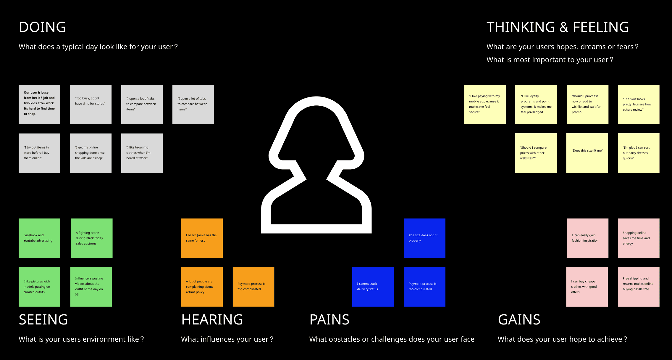
Empathy Map & User Persona
After conducting user interviews and gaining key insights, I created an empathy map to generate a cohesive, empathetic view of our users and organize research in digestible way.
Meet Tamilore
Next, I created a persona to represent the target audience as well as to build empathy with users by capturing user’s problems, motivations, wants & needs.
Throughout this project, the persona was referenced to anchor my solutions on users and to help me decide on features prioritization, establish information architecture, and detail-specific interactions.

Problem Statement & How We Might Ask Questions
Frame the problems
With the user persona and insights from the research stage, I turned my knowledge into a Point Of View (POV) Statement to frame the problem from the user’s perspective.
A young busy Media Personel needs to shop online at ease and feel confident in her decisions regarding the items' size and quality because she wants to spend time, effort on the things that matter.
"As a busy young Media Personel, Tamilore needs to buy clothes without hassle, moving from racks to racks just to find items that suit her taste & fits her perfectly because she prefers sparing time to hang out with family, friends and focus on her work."
After defining the design challenge in POV, I generated a series of How Might We ask questions to fuel my process for a solution brainstorming session later on.
How might we make the online shopping experience become intuitive and stress-free that helps Tamilore save more time and enegry.
How might we assure Tamilore of the right sizing & quality of items that helps her feel more confident in her purchase.
How might we digitalize the physical aspects of shopping that make Tamilore feel more tangible about the online shopping experience.
Ideate
To create a website’s navigation providing frictionless experience & meet users’ expectations, I need to uncover how the target audience’s domain knowledge is structured in terms of grouping items in clothing e-commerce.
User Flow
With a clear picture of the task, I then map out the user flow following the established task to explore the different paths and decision points users would take while interacting with the website. By doing this, I would understand users’ cognitive processes better when browsing through the site.

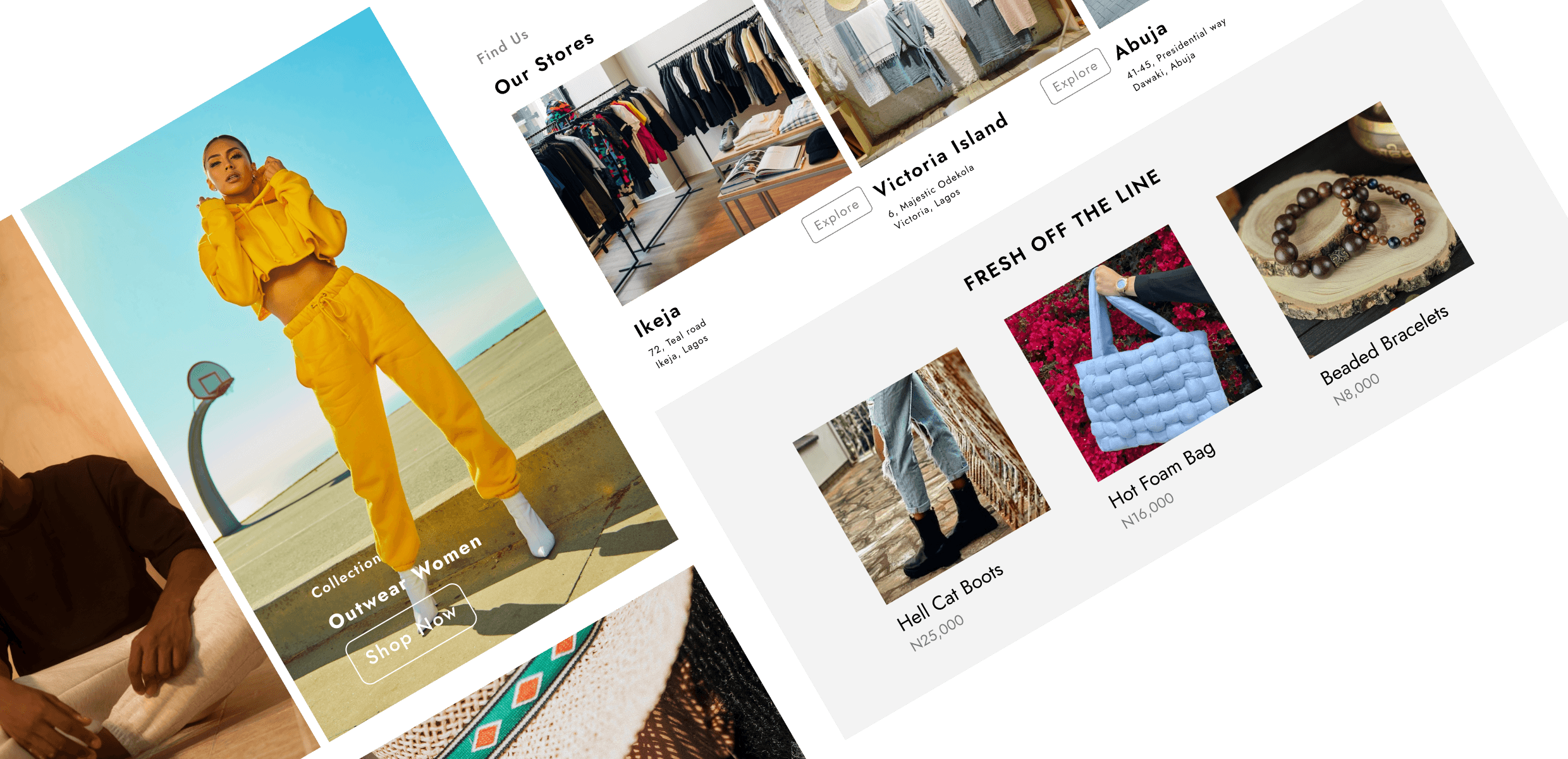
Wireframe
Mid-Fidelity Responsive Wireframes
Taking what I’ve learned throughout my process to this point, I drafted out the overall layout to get a sense of how content should be laid out in structured and logical way and most importantly to address user pain points. I also listed out the UI requirements and noted down the design patterns from other e-commerce websites to alleviate cognitive load for the user.
After deciding the visual direction of the layout that might best fit Tamilore’s goals and needs, I designed a low fidelity wireframes based on understandings of UI pattern across e-commerce.
I utilized 8px grids layout to scale down the content and components from desktop to tablet and mobile, to ensure the layout is fluid intuitively across different devices.

Prototype
High-Fidelity Design
With the visual style defined for the UI design and wireframes ready, it's time to put things together.

Testing
User Testing
After completing prototype, I tested the design on a group of users who fit the user persona in order to: Identify how easy or difficult it is for users to navigate website to complete the given tasks. Identify pain points, confusion occurring during their progress that would prevent them from purchasing products. Uncover any areas of frictions or opportunities to improve usability.
Methodologies
Moderate remote testing via Maze.
Participants
5 participants with age ranging from 20-36 years old
Have shopped online for clothing within the last 30 days
Have experience in shopping online for clothing, especially shopping via desktop.
Participants were asked to place themselves in the following scenario:
"It's summer time and you want to find a bag and bracelet for upcoming field trip, then you found Alte Pioneers ads on a Facebook page. You clicked the ad and landed on the Alte Pioneers page. From the homepage could you show me what you would do to find and buy the bag and bracelet. Please walk me through your thought and actions regarding to this journey."
Main Tasks:
Locate from the home page.
Homepage and product page walk through.
Add an interested item to cart. (In this case: Hot Foam Bag and Beaded bracelets).
The Results:
Here is the summarize of the result from my uasbility testing:
Completion rate: 100%
Error-free rate: 80% (Task 2: 1 user click at product card instead of product image to see full detail. While prototyping just set image is clickable).
Overall rating: 4.8 (on the scale 1-5, how easy it is to navigate website and add to bag the item that you want).
Conclusion
The Outcome
Based on first round of usability testing, 100% of participants complete the specific task with 80% error free rate.
Overall rating score: 4.8/5 (Based on High-Fidelity Prototype)
Score rating in term of how easy it is to navigate & add item to bag.
What I learned
This project has shown me why I should apply a design thinking framework to guide my work. By gaining in-depth understandings of people's motivations, needs, and frustrations before designing, we can create impactful user-centered products not only to address users' problems but also alleviate their pain points, create delightful moments along the way.
The importance of designing based on grid system as it helps to ensure responsive designs scale proportionally.
The usability testing is crucial and does wonder in uncovering usability issues which were neglected by me as the designer.
Overall, throughout the project I have gained a host of knowledge and understanding in the UX design process and e-commerce industry.
Moving Forward
Conduct a second round of usability testing to identify any other pain points that may occur and validate if the priority revisions improve user experience.
Prepare handoff documents to pass to developers.
Revisit feature roadmap and prioritization matrix to evaluate & proceed the next features that need to employ.